Thursday 24 April 2014

Data Collection Activity

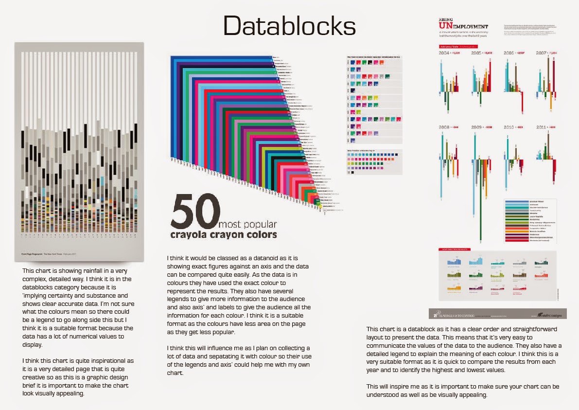
In my group of six we decided to split up into three's and count the number of a certain colour of car passed the college. Three of us went out the front of the college while the others went out the back of the college.
Here is my rough copy of our results...

Here are our results finalised with the correct quantities...

Initial Information Designs

Here are my initial charts for the information graphics.
I played around with different formats and ideas for how I would present my idea in the best way.

Final Information Design for Results

Here are my final charts for my data. As the results from the front of the college weren't that high I decided to look more closely at the cars that passed the back of the college as we had recorded whether the driver was male or female. I displayed this data in an bar chart showing the relation of men to women drivers of each colour of car. It was quite surprising that there were 30 more male drivers overall than men and also how popular silver cars are as 63 out of the 142 cars recorded were silver.


I also made a pie chart. The inner chart shows the number of cars of each colour that passed the front of the college. Which reinforces the popularity of silver cars. The outside chart shows the results of the back of the college in another format to the bar chart.

I have also made pie charts which show the female to male relation of the number of cyclists and dog walkers. I was fairly surprised by the cyclists figure as it is usually mainly men who cycle but as this was a very small sample I'm not too surprised.

Monday 21 April 2014

Initial Sketch of Idea

This is the first initial sketch of my basic idea. The plan is to have the names of the tv shows in a line across the middle of the page, then above will be a half pie chart with the centre cut out - this will show the genres that each show belongs to. Below will show the number of hours watched, the channel it was watched on, how I watched it and who I watched it with.
Here is the more refined sketch. This shows that I will use colour to differentiate each line to its category. I have adjusted the second pie chart so that it shows just the hours I watched each show and who I watched it with.

Saturday 19 April 2014

Results of Data Collection


Analysis of Results:

I watched a total of 13 different shows for between 1-5 hours each. I did record my opinion (in stars) for the show but as most were rated 5 stars I will probably not use this column of data. All of the shows were American so I will also not be using this column of data as it has no comparison. I will be using all of the other columns of data if I can.

Here are some of my handwritten notes I used to work out values and dimensions for my pie charts


This is how I decided which genres I would use to incorporate all of the shows and have a variety of genres.

Friday 18 April 2014

Development of Information Design (part 1/3)


Here are all of the fonts/logos for the TV shows I watched. I want to use them in my information design to show the individuality of each show and use the variety of fonts used to make it look more attractive. It may also make it easier for people to recognise a show if it is in the logo/font.

Here I resized each logo to fit into the guidelines

I then reorganised them into the year they were made to give more information

Then I added the coloured squares to each show that belongs to a certain category
Some TV shows will belong to less genres in the first pie chart than others but all have a designation to the 5 categories in the second pie chart

 I added captions to each category in the same font as the labels to give it a uniform look.

Here I drew (using the paintbrush tool) to get a look at the possible ways I could have the lines. I think that this one is too messy and the lines are too thick so I will be trying a thinner line that is more straight (geometric)

I also made the canvas longer and thinner to allow more vertical space for the lines to go to their origin point.


So I placed two rectangles to act as guide lines for where the lines would bend to go in their directions. I think this looks a lot cleaner and easier to understand but I think I should only use straight lines instead of having them curve at the bottom.


Here is the final design for the first pie chart I think it looks funky and would attract your eye to find out where the lines end up. Also even if you don't want to follow the lines you can just look at the key to find out which colour it is assigned to.

I found the second one a lot more difficult as there were much more lines and categories to get to. I found myself running out of space so I had to get more creative in how the lines would reach their origin points but I think it is still relatively easy to follow.

Thursday 17 April 2014

Additional Information Results

As I finished my chart quite early I decided to do some additional research into the shows themselves and used secondary research to collect some statistics and facts on each of the shows. Here are my results...